Colour and Perception
Colour Study
2023
I participated in the course “Colour and Perception” by Sini Vihma during my master studies in New Media. In
the course, we did practical exercises with colour paper to get a deeper understanding of colours in the
visual world. I then transferred these practical works and my gained knowledge into the digital world.
Software:
Illustrator, After Effects
Spatial Effect and Illusion
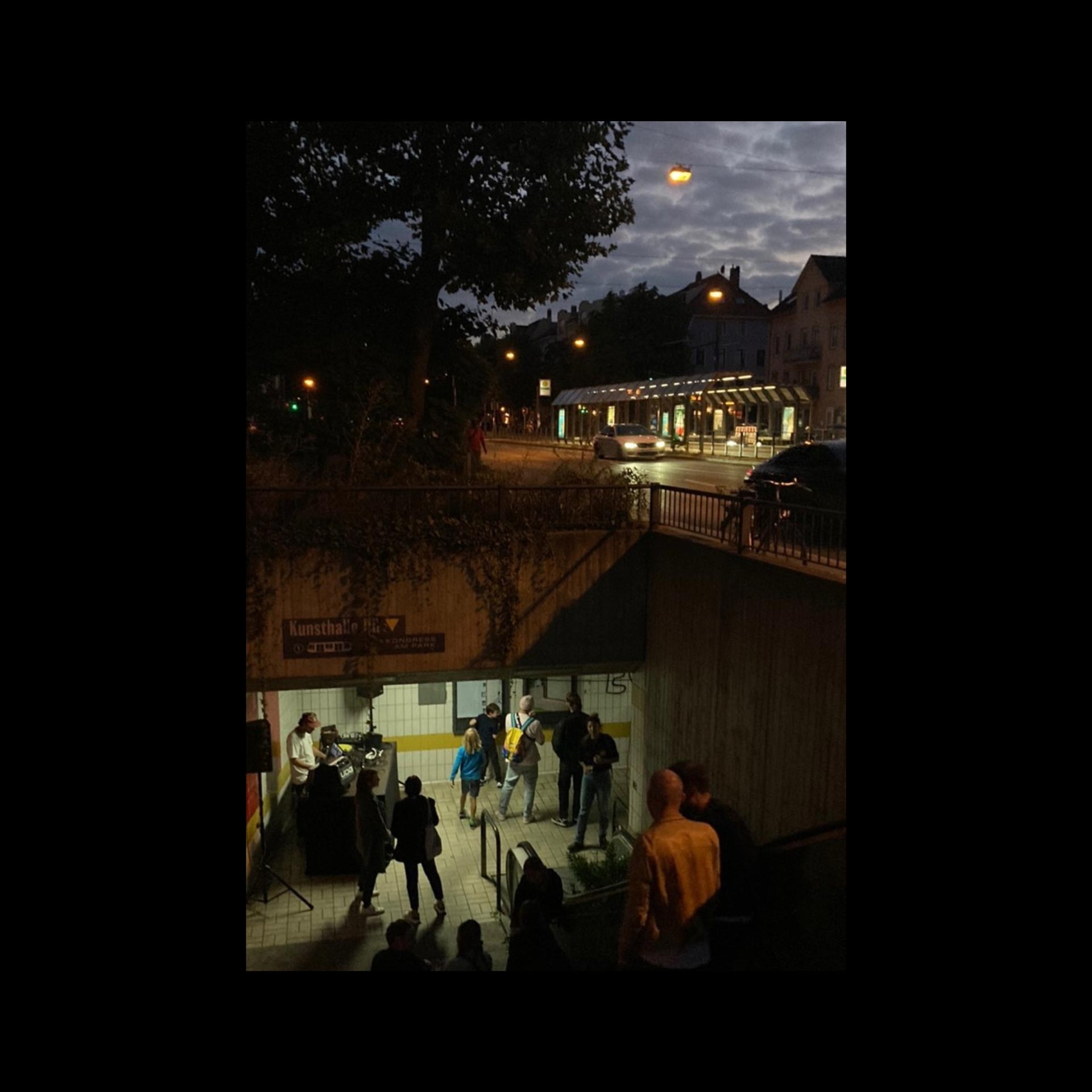
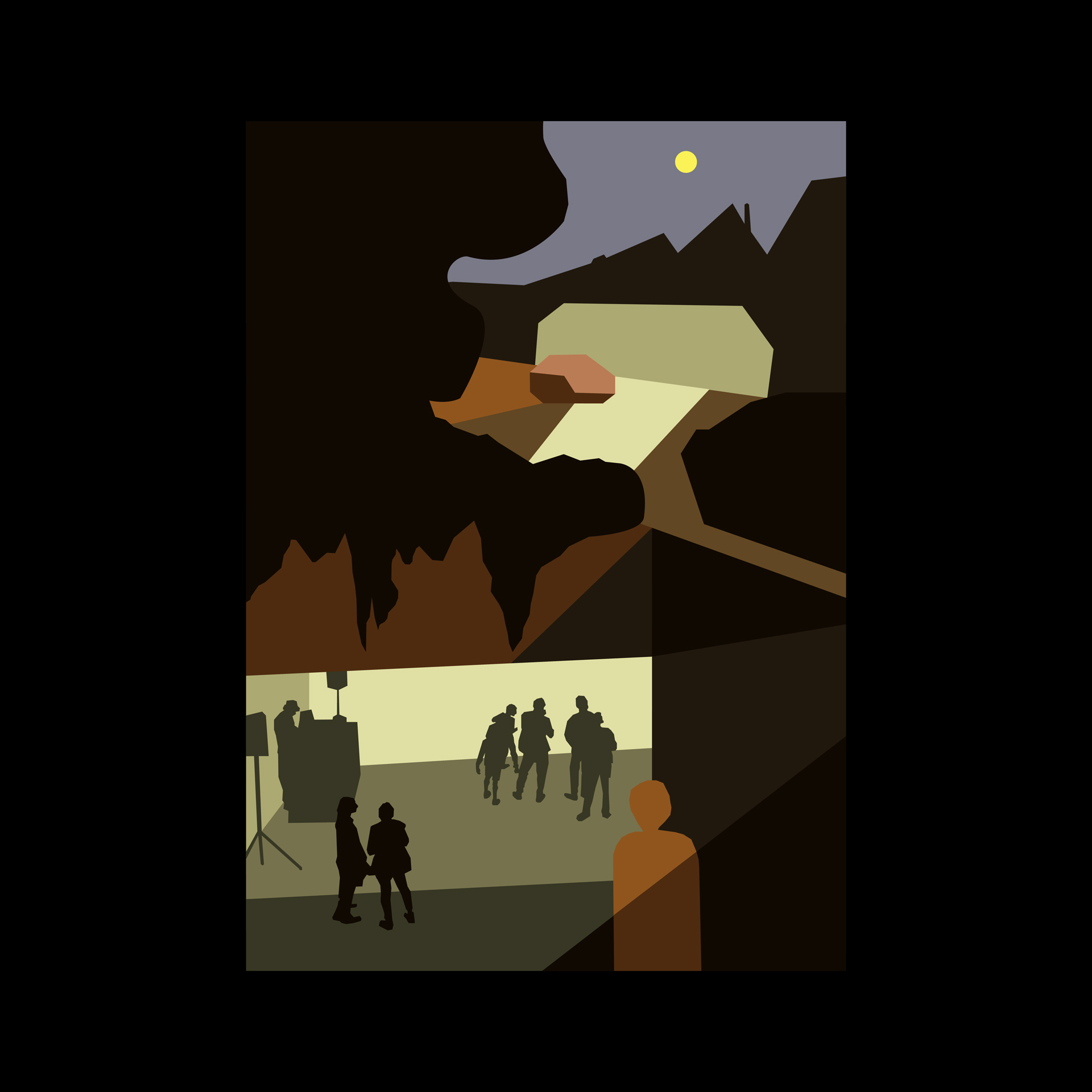
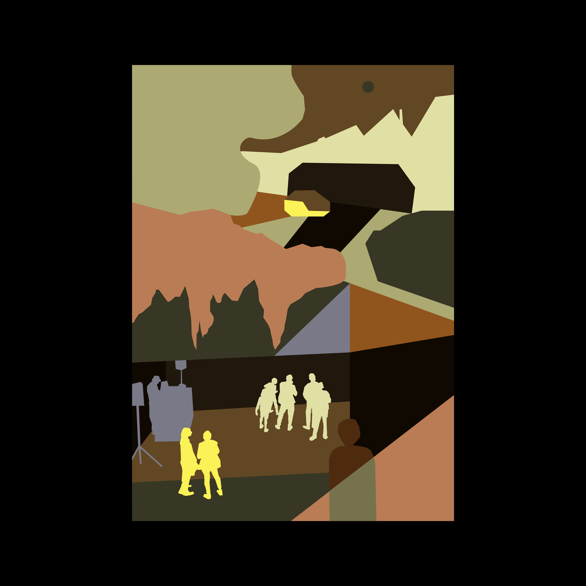
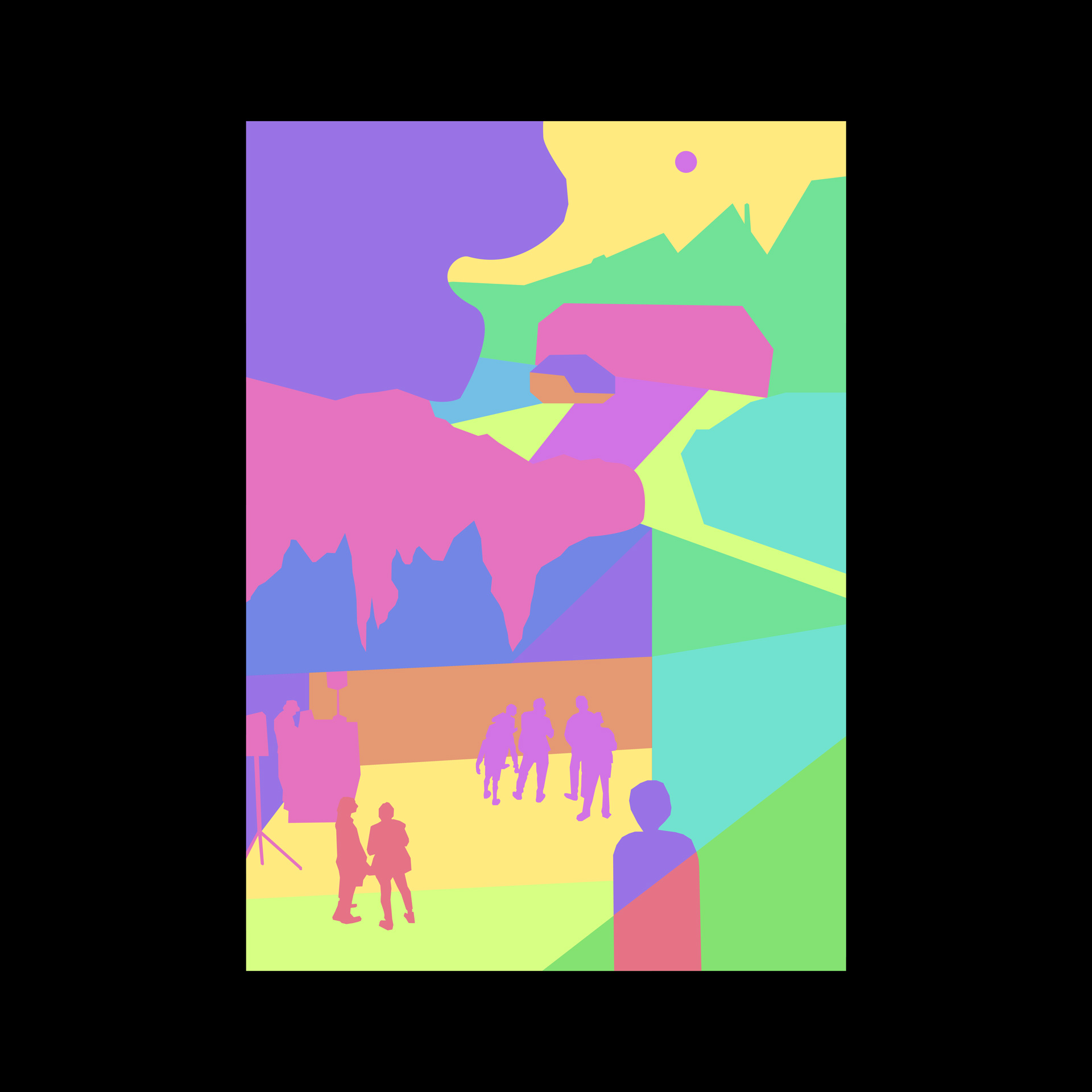
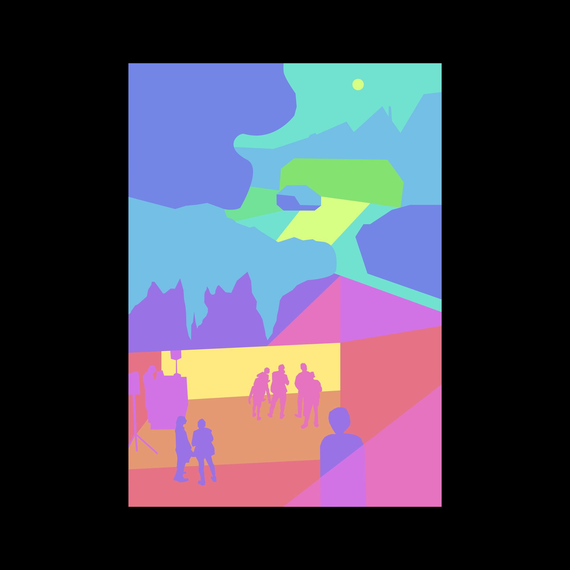
Minimalist illustrations of an urban night scene based on a photo by Lena-Marie Gribl. First, my aim was to achieve a clear sense of space and depth through the use of the same colours and visual cues as in my photo reference. I then used exactly the same colour palette but changed the order of colours to break the illusion of depth. In the other versions, I used vibrant colours of equal saturation and brightness to explore if and how the image could be perceived differently.
One Color Looks Like Two
In this exercise, I aimed to create optical illusions by making one colour look like two. I achieved the effect by surrounding one colour with two different background colours. I tried several combinations and concluded that the effect is strongest when choosing a light and dark background colour and a colour for the inner square of brightness in between the two backgrounds. This worked for chromatic, analogous, and even complementary colours.